
“Our designs dissolved the classic typography of tower
and podium to create a seamlessly fluid new structure - establishing a vision
for future achievements and referencing the university’s rich tradition.”
Zaha Hadid on Innovation Tower, Polytechnic
University Hong Kong

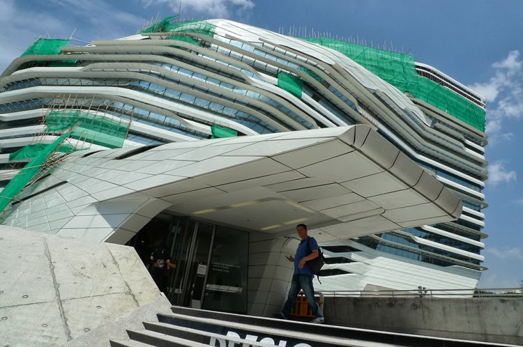
Photogenic mug-shot of the massive building
in the campus surrounding.
It looks
like a giant sailing boat marshalling in a sea of docile red-brick buildings. The opportunity was there, albeit lost
chances in the past, to rescue the campus from a humdrum of forced
homogeneity. On this course Zaha Hadid,
chosen for the task to break the mould or any mould, has a track record of
successes.
As in
most of her works, the public attention on the design school is measured by the
degree of how disparate it appears in its immediate context and beyond. The plastic volumes, intersecting profiles
and sleek bandings applied are conducive to a forward-looking expression, so positive that there requires a mandatory disconnection with learned
experiences and cultures. To expand
further, the school is a visual hagiography of optimism, not much different
from the utopian visions of Oscar Niemeyer in Brazil of the 1960s and only
comparable to the upbeat commercials of digital gadgets penned by advertising
executives in our cyber age.
Futuristic buildings - a description shunned by
Hadid on her works but used by most people nonetheless, are hard to
relate. Their purveyors operate on the
belief in the future; and for this reason they must distance themselves from
the past including established conventions and values.
Metaphor-making on these works can be tricky because they are inherently
“progressive” in appearance, any mind-mapping must be equally progressive to be
favourable. Therefore, it is easy to make
a joke on them metaphorically, but difficult on a commendation. Along this lead, most people fail, me
included. With embarrassment, my best
shot of a “giant sailing boat” is pathetically old-world.
The followings
are some observations from a recent visit and published drawings.
The building is heavily bandaged with
remedial works all-round.

(photo∣http://overover.com)
Aerial
photograph showing the solid roof above the wedge-shaped entrance. Whoever has the common sense to relinquish
roof glazing at the entrance is a good deed against energy-wasting and
greenhouse discomfort.

Original
design with full glazing sensibly scraped finally.

There is
not much logic to where the sun-breakers (white bands) are located. Many of them even wrap around the north side.

Series of
white banding and awkward massing
exacerbate visual distortions.

The
building looks clumsy at the road side.
The same misgiving occurs in some of Hadid’s works in which broad-brush
approach to volumetric handling seems to dictate over attempts on
refinement.

The other
trademark with her buildings is the fact that the roofs join the walls without
gutters separating them. This lack of
detailing is hell on weathering performance; in simple terms, the dust
collected on horizontal surfaces will create strands of stain on walls. For cyber-tech works including this, smeared
surfaces are signs of weakness and pessimism.
They are an irritation that keeps coming back. See the same problems on the Ordrupgaard
Extension below:

Floor Plan (+18m from ground)

Floor Plan (+38m from ground)
It is not
sure why the lecture theatres are located at the middle section of the tower
except an urge to be different is too overwhelming. This is inefficient spatial organization and is inflexible for possible overhaul in future.

Longitudinal Section
Apart
from the unconventional location of lecture theatres, it is strange to find
that some internal walls are slanted on this drawing.


(interior images∣purple li@http://purpleli.com)
These dramatic interiors are no ordinary learning spaces. Furnishing for the interiors is difficult as stylistic concerns always get in the way of pragmatic needs.
未來就是異樣 –
哈廸之賽馬會創新大廈 〈中文摘要〉
這棟新厦仿如一艘巨型帆船疾駛於溫婉的紅磚建築浩海中。在理工大學校園的同質建築群裡,過去曾出現設計突圍的機會均全告落空。而今次受聘的哈廸,成功地運用她破格不二之法,其成果可謂發揮得淋漓盡致。
貫切哈廸的風範,公眾目光的多寡往往建基她的作品與周邊環境和脈絡之差異大少。此設計學院的建築塑體展示、交叠輪廓及繆巧線條皆予人前瞻感覺;這正面的表徵卻源自對固有習性及文化歷煉的决裂。簡單說,這建築物充溢著讚頌未來之意,與上世紀六十年代奧斯卡.尼麥耶在巴西里亞構建的烏托邦式建築同出一轍。然以今天角度,最多只能與媒體創作人愛塑造的電子產品廣告媲美。
盡管哈廸不接受作品被冠名「未來派」,普羅大眾卻紛紛樂於引用這稱謂。無他,人們對這類抽象建築造型難於連繫。而這群設計師為宣揚美好將來的概念,需刻意與傳統價值及既定法則保持距離。若以隱喻法論述相關建築,觀其排斥性外型,情况特別狡黠;皆因正面思索應配以先進比擬例子,這點不易。所以揶揄它們實屬易如反掌;但若是讚譽的話,比擬須冠以同級〝先進〞例子,難度則高矣。循上述思路考量,大多數的嘗試難免失敗,本人亦不例外。在不畏靦腆底下,筆者在上文引用的「帆船」比擬亦逃不出舊世界思維。
其他有關對創新大厦的圖片個別評論,見英語版本。
No comments:
Post a Comment